How to Turn a Thrift Store Book into an Art Journal

  • 7 mins read
  • Published
You are currently viewing How to Turn a Thrift Store Book into an Art Journal

How to Turn a Thrift Store Book into an Art Journal

Your new favorite way to play, experiment, and fall in love with creating again

Why This Project is a Game-Changer

 We’re diving into one of my all-time favorite creative practices: turning a thrift store book into a one-of-a-kind art journal.

Why do I love it so much? Because it’s a safe, low-pressure space to experiment, make “mistakes,” and just play. When we create only for a finished result, we rob ourselves of the joy that comes from exploring and learning in the process. But when we give ourselves a place where the goal isn’t perfection (where it’s just for us) we open the door to massive creative growth.

This project is perfect for that. You’ll end up with a sturdy, inexpensive book you can turn into a creative playground… and today we’re going to make one together.

Why a Thrift Store Book?

I started using thrift store books for art journals because they check all the boxes:

  • Inexpensive – so you don’t feel precious about “messing up”
  • Sturdy – especially if you find books with thicker, slightly coated pages
  • Customizable – you can make the cover and inside pages match your style

And the best part? Every single page is an invitation to try something new. Some spreads you’ll love. Others… well, they’ll just be between you, yourself, and you. But every one of them will teach you something.

Supplies You’ll Need

Here’s exactly what I used in the tutorial:

Step 1: Choose Your Book

When I’m thrift shopping for art journal books, I flip through the pages before I buy. I love pages that are:

  • Sturdy
  • Have a slight coating (so they don’t absorb too much product)

If you can’t find a book like that, don’t worry, we’ll fix that in Step 2.

Step 2: Prep Your Pages

You have a few options:

If pages are already sturdy/coated:

  • Brush on a quick coat of white gesso over each page you plan to work on.
  • Slip a sheet of tissue paper between pages so they don’t stick together.

If pages are brittle or too absorbent:

  • Decoupage tissue paper over both sides of the page with your matte medium.
  • This strengthens the page and seals fibers so they won’t soak up your products.

Step 3: (Optional) Dress Up the Cover

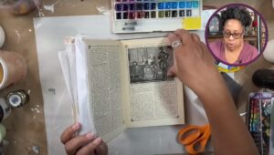
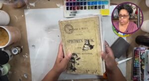
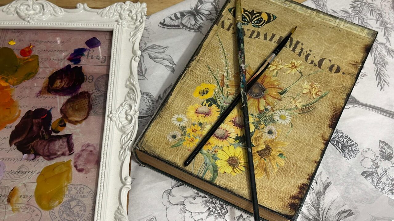
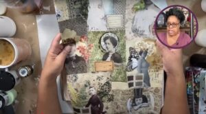
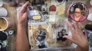
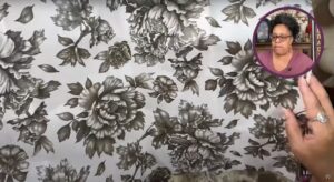
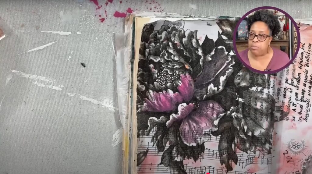
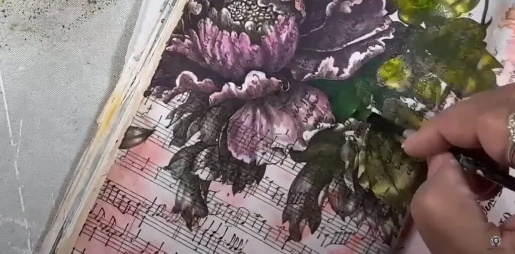
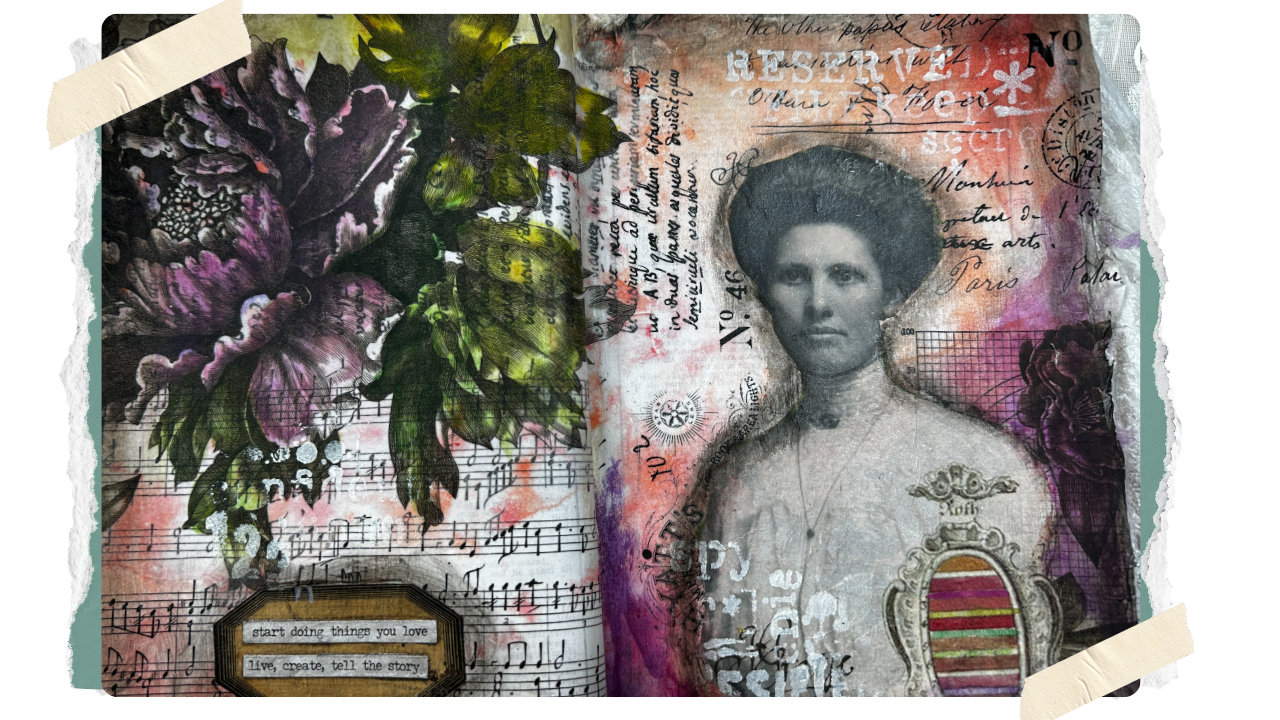
You can absolutely start with a plain book, but I love making the cover pretty right away. I decoupaged mine with Roycycled Botanical Masterboard Decoupage paper for instant inspiration.

Step 4: Add Your Background

For today’s spread, I used the Roycycled Typography Love paper as a background.

  • Mist the paper lightly with water so the fibers expand; this helps it lay wrinkle-free.
  • Apply a strip of matte medium along the spine crease first to secure the center.
  • Work outward, brushing medium under and over the paper to fully adhere.
Roycycled Decoupage tissue paper with typography.

Why I Love Paintable Decoupage Paper

Before we add our focal images, let me brag on my newest obsession: Roycycled Paintable Decoupage Papers. 

These sheets are printed in a neutral color palette with built-in shading, so you can:

  • Add your own color while keeping realistic depth and dimension
  • Coordinate with any palette you choose
  • Use them across multiple project types; furniture, home décor, cards, mixed media

Because they start neutral, they’re the perfect jumping-off point for experimenting. And since you’re in your art journal, there’s no pressure to “get it right”.  You can try bold colors, soft washes, or anything in between.

Step 5: Fussy Cut Your Focal Image

From the Photography Masterboard, I cut out my focal figure. A tip for easier fussy cutting:

  • Move the paper, not the scissors, to get smooth curves.
  • If your hands get tired, take breaks.  it’s not a race.

Step 6: Add the Paintable Floral and Subject.

I positioned the floral so it would work compositionally with my figure. No need to fussy cut the edges — the white tissue virtually disappears over a white background.

Step 7: Prep for Watercolor

Brush a thin layer of transparent watercolor ground over your entire spread. This turns any surface into watercolor-friendly paper.

Best practice is to let it cure 24 hours… but in our tutorial, I dove right in.

Step 8: Color the Floral

Here’s where the fun really starts.

I chose watercolors for their transparency; you can see the shading underneath, which keeps the flowers dimensional.

Color Theory Quick Tips:

  • Avoid layering complementary colors (red over green, purple over yellow) they’ll neutralize each other.
  • Stick to colors that are “neighbors” on the color wheel for vibrant results.

Harmonize your palette by adding a touch of one color into all your mixes.

I started with my lightest pinks, leaving some petal tips white for highlights. Where I wanted more depth, I layered in darker purples (still in the same color family) once the first layer dried.

Want to go deeper?

My Crafting in Color Course breaks down color theory for crafters in a no-pressure, practical way.

Step 9: Paint the Leaves

I mixed multiple greens, toning down overly bright shades by adding a bit of red-violet (their complement) for a more natural look.

Switching between green mixtures as you work keeps leaves from looking flat or uniform.

Step 10: Add Finishing Details

Now’s your chance to play with:

  • Scribble sticks for grunge (smear them with your finger or matte medium)
  • Stencils for texture
  • Small ephemera (tags, word stickers, etc.)

I balanced color by repeating my purple tones on both sides of the spread.

Your Turn!

I hope you’ll grab a thrift store book and turn it into your own creative playground.

Remember: this journal is your space. There’s no “wrong” here, only opportunities to try, learn, and grow. Whether your pages turn out gorgeous or a little wonky, every spread is a step forward in your creative journey.

So let’s give ourselves permission to make a mess, try the bold colors, and see where curiosity leads.

Not at all! You can use acrylics, inks, colored pencils, or even pastels. I chose watercolor for this project because it’s transparent , you can still see the built-in shading of the paintable paper.

You can, but hardcovers hold up better over time and give you a sturdier surface to work on. If you do use a softcover, you might want to reinforce the cover with chipboard or an old file folder.

You can slip a sheet of tissue paper or wax paper between pages when you’re working. Let everything dry completely before closing the book.  For extra assurance, you can wax your pages once they are completely dry.

Not unless you want to! Because the paintable papers are on white tissue, the edges melt into a white or light background without cutting.

 I like to gesso several pages at once so they’re ready when inspiration strikes. Just make sure they’re completely dry before stacking.